Friday, March 27, 2015

Tweak of the Week

When we last left our kitchen, it was looking pretty bright, fresh, and very close to my mental image of its full potential.


The original intention of our pendant lights was for them to act as task lighting for our peninsula, but now that we have the can lights, the room is pretty evenly flooded with bright, useful light. That's when it occurred to me that our pendants could stay, but could act more as accents to the room rather than work lights.

I have been pinning kitchens for years that have caught my eye. Something I hadn't noticed till recently was what they had in common: their pendants were mostly clear, globe shades with exposed bulbs. Here is a perfect example from Southern Living.


I looked up a couple of these lights and found that they were completely out of our price range (especially since we already had working lights there). $100 each? Heck no. West Elm can keep 'em.


It was time for a little DIY.

I decided that this was certainly something I could tackle on my own. I researched glass cutting on Pinterest and found many tutorials on how to cut holes in glass. The issue I ran across was that the hole that they would show being cut was kind of small. They were able to use a large bit and do a single cut. I had to make a hole large enough to feed in the part that sandwiches the shade which was much larger.

I looked at large diamond tipped bits (for glass cutting) at Home Depot and Lowes. The smallest one they had was $20...for one bit. After I was able to recover from the shock, I regained my senses...and headed to Harbor Freight.

Anyone who frequently DIYs knows that Harbor Freight is the best.

I wasn't able to find any drill bits there, but I was able to get a multi bit diamond tip set for my Dremel for around $7. Score.

I also grabbed two $6 fishbowls from Michaels and a can of Metallic Silver Rustoleum spray paint from Home Depot. All in all, the project probably cost us $20 in all.

I began by covering my fishbowls in painter's tape. This would help give the bit purchase when I first got started. It also kept it from hitting the glass if the Dremel jumped while I was cutting. I then cut a circle the size of the hole I needed (using the old lampshade as a template) and cut it out. I placed it on the painters tape, lined it up with the center of the flat part (which I had marked on the tape earlier), and drew around the edges with a permanent marker.


When the template was removed, it looked like this.


Next, I took it out to the garage where I had created a little work station on the workbench. This included water (in a spray bottle or cup), my Dremel, my bits, a lights, and an old towel. The towel is nice because it both soaks up the old water and keeps the fishbowl from getting scratched up by any small glass bits or the table itself.


And always remember. Safety! There will be bits of flying glass and glass powder, so I absolutely recommend safety glasses.

University of Kentucky College of Fine Arts hoodie and/or degree is not required.

I also had my hair back to keep it away from the Dremel's Spinning Bit of Hair Pulling. In other words, I don't recommend doing this wearing a three piece suit.

Maybe with a bowtie. Bowtie's are cool.

Anyway.

I began by pouring some water over my tape. The water will keep the bit from overheating against the glass, so be sure to frequently re-wet your working area. Then I began by essentially drawing the circle in with my bit.


After this step is done, the rest is actually pretty easy. I just kept repeating the circle. Over and over.

It takes a little pressure, but by no means do you need to get stabby with this project. Remember to keep the surface wet and just stay with it. The bit does most of the work.


Eventually you'll break through to the other side. The bottom of the bowl is going to be thicker than the glass around the sides, so this project is actually a lot easier than it looks. When you break through, you can use the side of your bit to continue cutting through.

  
Once you get most of the way around, you can either continue till it naturally breaks from the vibration of the Dremel, or you can use LIGHT PRESSURE to press on the circle and let it break on your own terms. Once the circular chunk of glass is gone, you can clean up your edges with the side of your Dremel bit.


I would go back and forth making sure that the fitting in the light would fit in the hole. When I was done, I removed the painters tape and used an old sponge (remember, glass bits everywhere) and some dish soap to clean it up.

Here is a side by side with our old shades.


Mmmmm. So good.

I repeated this process exactly for the other bowl. The entire process for one shade takes about 30 or 40 minutes.

While I had originally gotten white pendant bases, I felt that silver would really help these stand out a little better. I had issues removing the bases from the ceiling, so I just painted them while they were up. I have never done a makeshift spray booth before, but it wasn't as intimidating as I thought it would be. I actually just used some printer paper and taped it around the ceiling portion. The "walls" were made with a 99 cent drop cloth from Home Depot. The bases were primed, then painted in the Metallic Silver.


Once they were sprayed, had dried, and were put back together, I was finally able to do some final assembly. This included replacing the bulbs with a couple Edison bulbs to really add interest. We wouldn't have done this before because they cast a much more yellow light, but as an accent, the Edison's are so fun. They are actually dimmable, too, which is nice because we already had a dimmer switch installed.


When they were all together, they really made the space feel magazine-y. It feels very high end, but obviously not at a high price.


Here's the finished product!


Making these glass globes really made me feel like I can tackle so many more projects that might involve glass in the future. What do you think? Would this little guide help you feel more comfortable cutting glass for your own craft needs? I hope so! 

Wednesday, March 25, 2015

Lighten Up

To finish out our Tax Return series, we figured we would share our latest endeavour.

And guess what...it's in two parts!

Part one: Making our Kitchen Glow

Ever since the cabinets have been finished in our kitchen, we knew that they wouldn't look bright and clean without new lighting. As it was, the only light that the kitchen came with was in the center of the ceiling, directional (which meant it was horrible for task lighting), and looked like it was about to burn down our new abode.

OBSERVE:

 Referred to as "Death from Above" more than once.
It was obvious that it needed to go.

I had been thinking about it for a while. I considered possibly putting in a flush mount ceiling fan with a light, but wasn't sure that was going to give us the light we needed for cooking. I also considered just replacing this centered fixture with yet another centered fixture, but our kitchen is pretty wide, and this really suffered when it came to the corners.

One day while flipping through Pinterest, it slapped me in the face. All of the kitchens that I tended to pin either had large windows to the outside (which would be impossible for us), or had canned lights in the ceiling. After playing around with it in my mind for a while, I really became attached to the idea.

We purchased four lights (actually, two packs of four) from Lowes on sale for $29.99. They are 6" can light inserts in a medium warm light.


 I was also instructed by David (of Over on Dover) which in-ceiling mounts to purchase. They looked like this (one for each light).


After roughly marking the spots that we wanted them mounted, we ventured into the attic and started some recon. We knew that we would need to move insulation and boards out of the way to install the lights, so Scott cleared between both of the sets of studs we were near, just to be safe.

Welcome to our attic! It had the Christmas lights when we moved in. It's actually kind of nice up there, except for the horrible heat.

It was a little tricky getting to the lights located above the fridge and microwave because they were closest to the original outside edge of the house. They were practically where the rafters met the ceiling/addition.


After we had prepped from above, we returned down below to begin drilling holes to allow us to find where the lights would go from the attic. This also helped us make sure that we had enough of the insulation out of the way for the installation.

To do this, we bought the longest drill bit I've ever seen. It is almost hilariously long, but we knew it would poke up through the attic floor, allowing us to see it.

Badass.

Here is one of the holes we drilled. I would drill up till Scott said stop, then he would make sure that the area was clear of debris and we would move to the next one. We did this for all four lights.

The hole from the bottom

The hole from the attic

After the lights were marked and drilled, we began actually cutting the holes for the light mounts themselves. We thought that this would be the easiest part of the process. We were slightly incorrect.

David brought over this really cool circle cutter that is actually made for this job. It mounts to your drill and it uses two sharp blades to cut circles till your cut comes free. The first time, it worked, but it began to slow halfway through the ceiling.


The second time, it didn't even make it all the way through. Oh, and it began throwing sparks (for video of the sparks, see our Facebook page! It's pretty awesome!). We ended up using it to mark the circle we needed, then cutting it with a drywall saw.


Turns out, our ceiling wasn't drywall. It was a mix of drywall and plaster, possibly with some cement (not kidding), making a cross section look like a Dagwood sandwich.

Hold the mayo.

This also explains why the hole cutter ended up looking like this.


The points are supposed to still be pointed, not flat.

Oops.

We did finish cutting the holes, though. It was a weird feeling, having a view of the attic from the kitchen.


David then proceeded in installing the ceiling mounts. They are mounted by inserting them from below, then pushing them up through the pre-drilled hole.


This part is then held in by pushing tabs from the inside of the light, out. Tension is used to keep them in place.


Here are a couple of just the mounts installed.


Once all of the holes were cut and the mounts were installed, we could finally take down the center light.

Before: Minus two installed can mounts.

After: With five open holes to the attic.

The hole in the center was patched with a square mesh sticker and some putty. It doesn't quite match, but we knew that painting this ceiling was probably going to be on the docket at some point. At least the hole is closed and less of a spider entry now.

The lights themselves were inserted from below and are held in by tension wires. They took about a minutes to install. Even off, they made everything feel so finished.


When it was all done, it was an amazing change.


Scott had a whole different perspective of this project, but we decided that this post was running a bit long. He'll come back with information on how he and David actually wired everything in from the attic portion of this install in another post. Till then, look forward to Part 2: The Accent Enlightening!

Monday, March 16, 2015

Stumped

This is the story of a stump. This stump has lived in our backyard since we moved in. It has made mowing tricky and I considered it to be an eye sore. Our weather the last week has been beautiful, so I decided to clean up the backyard a bit. While doing so, it occurred to me that it was time for the stump to go.

All pictures from my phone. Sorry for quality.

I grabbed our little electric 14 in. chain saw and just started cutting (with appropriate eye, hand, and foot protection, of course). I cut as close to the ground as I possibly could to allow the mower to run above it without hitting the blade.

Due to the lack of gas power to my weapon of choice, the cutting process did take a while. I cut all the way around, making sure to catch it at angles that would allow the chainsaw to really dig into it. About 20-30 minutes later, I was able to knock it over with my hand.


Once it was down, I remembered that I had seen a natural way to help the rot process take out the remaining small stump and root system. It looked so easy, I decided to try it out.


As you can see above, I started by drilling multiple holes about an inch or so apart randomly over the whole remaining stump. Instructions then told me to follow up by rubbing pure Espom Salt into the holes and watering it just enough to help moisten the wood to allow the salt to do its work. Apparently Epsom Salt is good for gardens because it works as a fertilizer. Good to know!


You can see the white holes on the right that have already been filled with the salt. I just rubbed it in with my hand.

That was it! Hopefully in the next month we will start to see some rot progress. I figured this would be a fun "try it and follow up" post, so about a month from now, I'll let you know how it's going! 

Tuesday, March 10, 2015

Making a Splash with Backsplash

One of the rooms in our home that has been slowly morphing into a space we love is our kitchen. Since literally the first day we've lived here, we have been sanding, painting, and renovating it into a low-budget looker.

Part of the process has been realizing what is worth spending money on in a house we will not live in forever. The other part is realizing that certain high luxury items can really make the rest of the room pop (and also helps resale quite a bit). One of these items for us was the backsplash. Even though we had been able to use our original cabinets and some low cost pendants to really brighten the space, a nice tile backsplash was just what the room needed to bring it to the next level. Aside from looking nice, it would also lighten the room and be easier to clean than the painted walls (which were pretty gross).


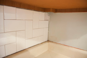
Mom and I had been discussing the backsplash for a while. Mom has tiling experience, so between Pinterest, magazines, and my own ideas, I was able to work with her to come up with a low cost yet interesting design. I decided that straightforward subway tile was the way to go, leaving the interest to the pattern in which it was placed. I loved herringbone, but felt that the traditional angled style wasn't for me. We ended up using a pattern that would make it more horizontal and squared with the wall, keeping with our kitchen's clean modern theme. This would be slightly accentuated by the lightest gray grout we could find.

Fortunately, our friends Beth and David Over on Dover have just finished working on a bunch of tiling in their basement. They had a tile saw, tile cutter, and almost half a large bucket of mastic that they let us use. This kept our cost down quite a bit, leaving the budgeting to go directly towards the tile itself.

The standard sized white subway tile is about 6in x 3in and comes in boxes of 12.50 sq ft, but each tile is technically sold separately, so anything we didn't use, we could return. We got three boxes to cover our almost 30sq ft, leaving enough for "oops"es and "ah crap"s. After adding two tile sponges, 5 pieces of bullnose for the ends, and a bag of unsanded grout in the color "warm grey" to the cart, we were ready to go.

First, clear everything off of the counters (except for our green teapot which is floating around the pictures for some reason)


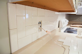
Dad took off all of the outlet covers (3) and the knife rack before we started. Like with painting, having these things out of the way early makes it a little easier to work around.


Mom and I knew that we would be working from the outsides in. We have two main walls in our kitchen, so the corner where those walls meet would also be where our tiling would meet. This would hide any inconsistency (because the corner is pretty dark) and make the more-noticeable ends look much better.


Mom also laid out a test pattern on the counter for us to glance at as we worked. This was especially helpful in the beginning because it allowed us to double check our tiles before cutting or placing them.


We began over the peninsula with the bullnose. Mom showed me how to place a layer of mastic, then align them with a line we had drawn with a level vertically showing the end of our cabinetry. After the two bullnose were up and wiggled into place, the actual pieces of subway tile could begin going in.

Since Mom had tiling experience, she was on the tile saw out in the garage. It's been cold here, so we just kept the door from the house open, the garage door shut, and had a small heater going in the corner. It really wasn't an uncomfortable working environment...well...except for maybe the wet saw outfit Mom ended up wearing.


She wore my raincoat and some safety goggles to keep from getting soaked and safe from shards. It actually worked pretty well and I think once we got into the groove, she didn't mind it too much.


If you've never used a tile saw before, allow me to describe it to you. It's very wet, but very awesome for cutting tile. It's a dull blade with a sandpaper-like texture all around it that grinds through the tile to make the actual cut. This means you need to allow for a kerf, or an amount of material taken out by the blade's width, when you are measuring or marking your tiles. We didn't get it perfect every time, but we always tried to allow for too much rather than too little when making cuts.

After a couple of hours (and a nasty session of cleaning behind the stove. There was an old, used Steak'n'Shake plate...gross...), we had finished the first wall. The cool part was how perfect the width was that we didn't have to make special cuts at the end!


There was some trimming that had to happen as we went due to the height of the cabinets from the counter top changing, but it was mostly straight cuts, which helped.


We then moved to the other end of the cabinets on the other wall (shown to the right in the picture above) and began the pattern there, moving back towards the corner. After the bullnose was placed (much like on the other wall), this meant adjusting our tile laying to recreate it backwards so that the pattern would flow correctly.


Above, you can see where I would place the mastic going from right to left, then place my tiles in the appropriate pattern. Thankfully, I still had this laying around to reference.


Once everything was massively mastic'd and totally tiled, we could step back and admire our work. It did look pretty awesome, if we do say so ourselves.


It took about 7 hours (with a lunch break) to get all the tile on the walls. It wouldn't have taken so long if I'd done a more traditional subway tile pattern, but I think the herringbone just adds a little extra lux to it.

We waited overnight, then we grouted.


This was the easiest part of the process. We made about a quarter of the bag of grout (after reading the directions and using the correct amounts of water plus a little) and I began using a float to smooth it into the cracks.


I used a crisscross pattern to make sure to cover all of the grout lines. Mom waited about five minutes after I started, then followed up behind with a sponge and some water to wipe down the excess.

While we grouted, Dad placed spacers behind the outlet screws to bring them into level with the additional tile width. These are sold at any Lowes or Home Depot and are very easy to use as they interlock. The hardware guy also suggest some extended screws, which we were glad we had purchased since one of our outlets was just a little further than the others.


Mom only had to do one wipe down of the tile. Any haze left after that was buffed out using a clean, dry cloth. Then the outlet covers were placed back on and everything started coming together. There was just one more thing that was bothering me.

After we had painted our cabinets (almost three years ago now), our friend Leah had pointed out the fact that I never painted under our cabinets. I never thought anyone would notice, so I didn't worry about it too much, but with the new backsplash, it's suddenly all I saw.


So this under cabinet painting is dedicated to Leah, the one who knew it all along!


And with that, we are practically finished! There is still some caulking to do around the edges where the tile meets the cabinets/counter tops, but that is not crucial and I think I might just let someone with more experience finish that one up for me.

So here is our current Hero Shot. What do you think?


I love it! It's amazing how much light reflects off of the surface of the tile and bounces around under the cabinets. It really lightens up the work area under there as well as the rest of the room. I like the grey grout a lot, too. It is just dark enough to hopefully hide stains, yet subtle and none intrusive to tile pattern.


Both of those are under the same light. It's amazing what it did to the space!

Do you like the look of tile or do you have another favorite backsplash that you're dying to try out? Let me know in the comments!

We have more big plans for this kitchen, some of which are happening in the near future, so keep checking back with us for more updates!